

In 2015, Lankelly Chase and Heriot-Watt University published the Hard Edges report on severe and multiple disadvantage. As well as showing the number of people accessing substance use, homelessness and criminal justice services at the same time, it also broke down regional data to give a ‘hotspot’ analysis of the areas where clustering disadvantage was the most concentrated. This makes it comparable with a huge number of other national datasets which break down information by Local Authority area, with a few picked out below:
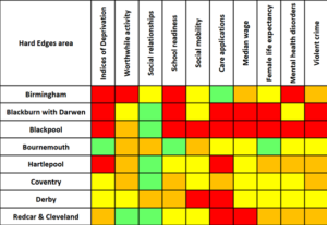
This Tetris-like grid takes the 20 local areas with the greatest prevalence of severe and multiple disadvantage as defined in Hard Edges and shows where they rank in a selection of other national datasets on issues like deprivation, social mobility, average wages and the number of care applications. Of 152 upper-tier Local Authorities, a red block indicates ‘bottom’ 20, amber bottom 50, yellow the middle ground, and green the top 50.
Having put this together, I’m tempted to interpret it in two different very different ways.
1. Fascinating – please tell me more! This confirms some suspicions and shows some interesting outliers too.
Hard Edges illustrated how disadvantage clusters at the individual level, like the significant proportion of people in drug treatment who also access homelessness services. This table shows the same dynamic at work in places: many of the same areas rate similarly under multiple measures, showing how different elements of social and economic wellbeing surround, compound and reinforce one another. There are also a few curious cases where disadvantage and strength lie side by side, so what can we learn from these? What’s going on in Bournemouth and Coventry, which are both Hard Edges ‘hotspots’ but have no other red patches at all?
We need a consistent drumbeat of data to keep issues on the agenda and refresh people’s minds as to their importance. This kind of data – piling conclusions from multiple sources together to form an even stronger argument – also helps us to call out perverse inequalities in the allocation of resources: just last week it was revealed that compared to an average British council spending cut of 14.3% over the last decade, Blackburn, Liverpool and Stoke suffered well in excess of 20% (pdf). Surely this should be challenged using the strongest data we can assemble?
So, a conclusion is – let’s run with this and look in more detail to increase our understanding. How can we join up the disparate audiences involved in the creation of this data and figure out what this information looks like as an interconnected whole? How do we build on the oases of green – like social relationships in Middlesbrough, low levels of violent crime in Stoke, and Birmingham’s record on care applications?
2. Oh dear. This tells us nothing we didn’t already know.
We were told hundreds of years ago – literally – that sorrows come as battalions rather than single spies, but we seem addicted to proving this to ourselves again and again.
Large swathes of red surround places like Blackpool, Middlesbrough, Rochdale and Stoke, piling multiple ‘deficit definitions’ on the same local areas. How many ways of saying basically the same thing do we really need to find, and for what purpose? Indeed, whose purposes are we serving? Whose appetite is sated by this new knowledge, which – as a side point – we have not discovered in the wilderness but created ourselves? Slicing the data in ever more novel ways doesn’t advance our work, and may even set us back as we continue to invent new measures and apply them to people and places who have no ownership or agency over the reports or the ‘recommendations’ which tend to accompany them.
And further – if we are stuck in the mindset of there being a number of different, siloed problems, we inevitably end up arguing about which is the most important issue to prioritise, resulting in a multitude of calls to action which emphasise children’s service reform/inclusive growth strategies/targeted parenting interventions/more ‘joined up working’ (delete as appropriate), or confusing chicken-and-egg debates about which problem ‘causes’ which others.
So our conclusion is to turn off the quantitative data tap and focus our efforts elsewhere – like working in a genuine, participatory way with local communities, building on strengths, establishing what’s actually meaningful to them and how they want to make changes, and finding methods of support that people can engage with positively rather than just hearing, yet again, how awful their town is.
We could even give ourselves a new rule of thumb – the Blackpool Rule, since it rhymes? This would say that if we design a new statistical measure – let’s call it the ‘Social Vulnera-Mobility Index of Community Risk’ – and it just tells us that a certain group of northern post-industrial towns are ‘in need’ of ‘intervention’, then perhaps it hasn’t told us very much at all.
Which route would you take?
Sources: Life expectancy and Median wages from ONS; Indices of deprivation from Gov.uk; Care applications from Cafcass; Social mobility from the Social Mobility Commission; and others from the What Works Centre for Wellbeing.